Analytics
Excel Analytics & Operational Dashboards
A collection of Excel-based analytics and operational reporting solutions developed to turn complex program data into accessible decision-support tools. The dashboards provide interactive filtering, planned-versus-actual tracking, strategic progress monitoring, and structured cost estimation within familiar Excel workflows.
- Excel
- Power Query
- PivotTables
- Advanced Formulas
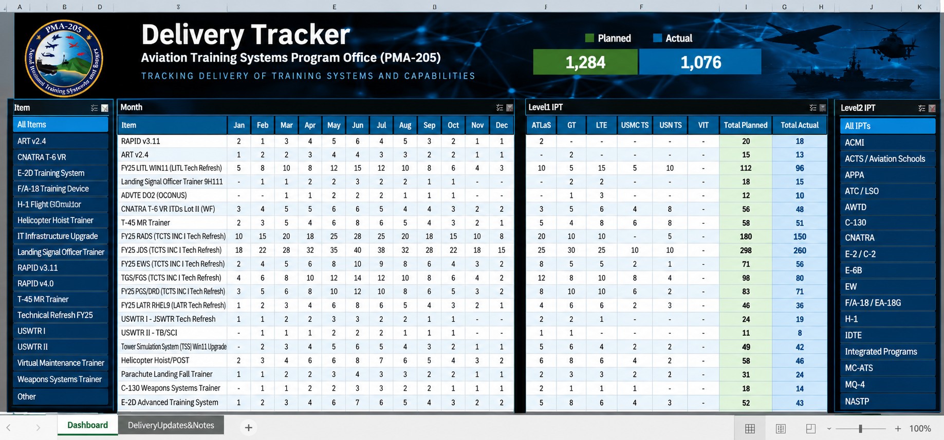
Portfolio Demo: Screenshots use sanitized or fictional demonstration data. Organizational and sensitive information has been removed or replaced for portfolio presentation.
Business Problem
Operational and program data was maintained across spreadsheets and recurring reports, making it difficult for stakeholders to quickly monitor delivery performance, strategic progress, costs, and key metrics.
Solution
A collection of interactive Excel dashboards and reporting tools that transformed operational data into centralized, filterable views for delivery tracking, strategic progress, and cost estimation.
Requirements
- Centralized visibility into operational and program metrics
- Interactive filtering across programs, teams, items, and reporting periods
- Planned-versus-actual performance tracking
- Structured reporting views that could be maintained within Excel
Architecture
- Excel workbooks serving as the reporting and analysis interface
- Structured source tables supporting repeatable data updates
- PivotTables and PivotCharts for aggregation and interactive analysis
- Slicers, formulas, and dashboard components for dynamic reporting
My Role
- Gathered reporting requirements and identified key operational metrics
- Structured and prepared source data for analysis
- Designed and developed interactive Excel dashboards
- Built filtering, calculations, and reporting views for stakeholder use
Challenges
- Organized complex operational data into dashboards that remained easy for stakeholders to navigate and maintain.
- Designed multiple reporting views for different business needs while maintaining consistent data structures and presentation standards.
Lessons Learned
- Interactive Excel dashboards can provide effective self-service analytics when the underlying data structure and user experience are designed carefully.
- Separating source data, calculations, and presentation layers makes complex workbooks easier to maintain and scale.
Business Impact
- Centralized recurring operational metrics into accessible dashboard views.
- Reduced manual effort required to prepare and interpret recurring reports.
- Improved visibility into delivery performance, strategic progress, and cost information.
Future Improvements
- Automated source-data refresh
- Expanded trend and forecasting analysis
- Migration of selected reporting workflows to Power BI